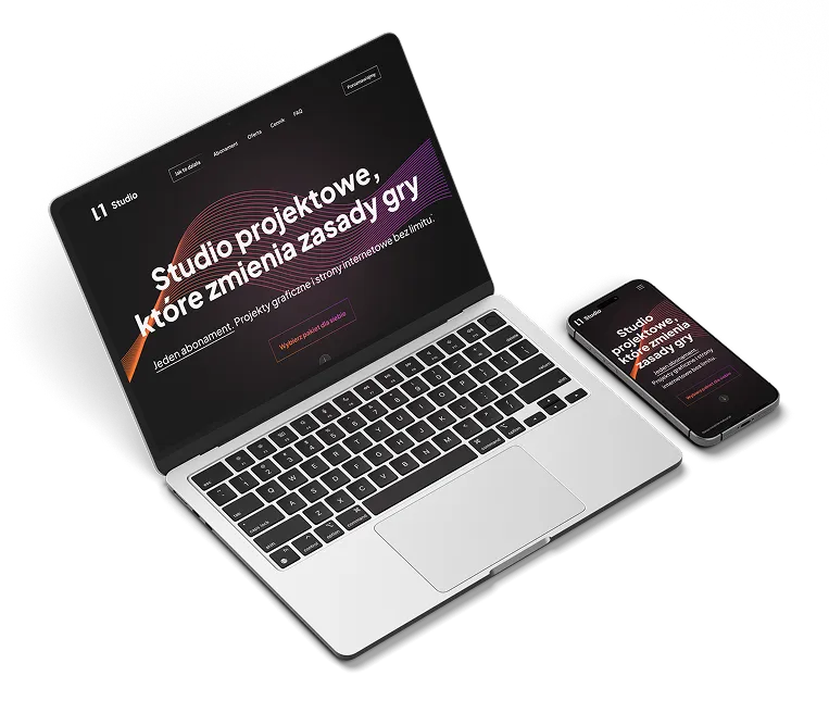
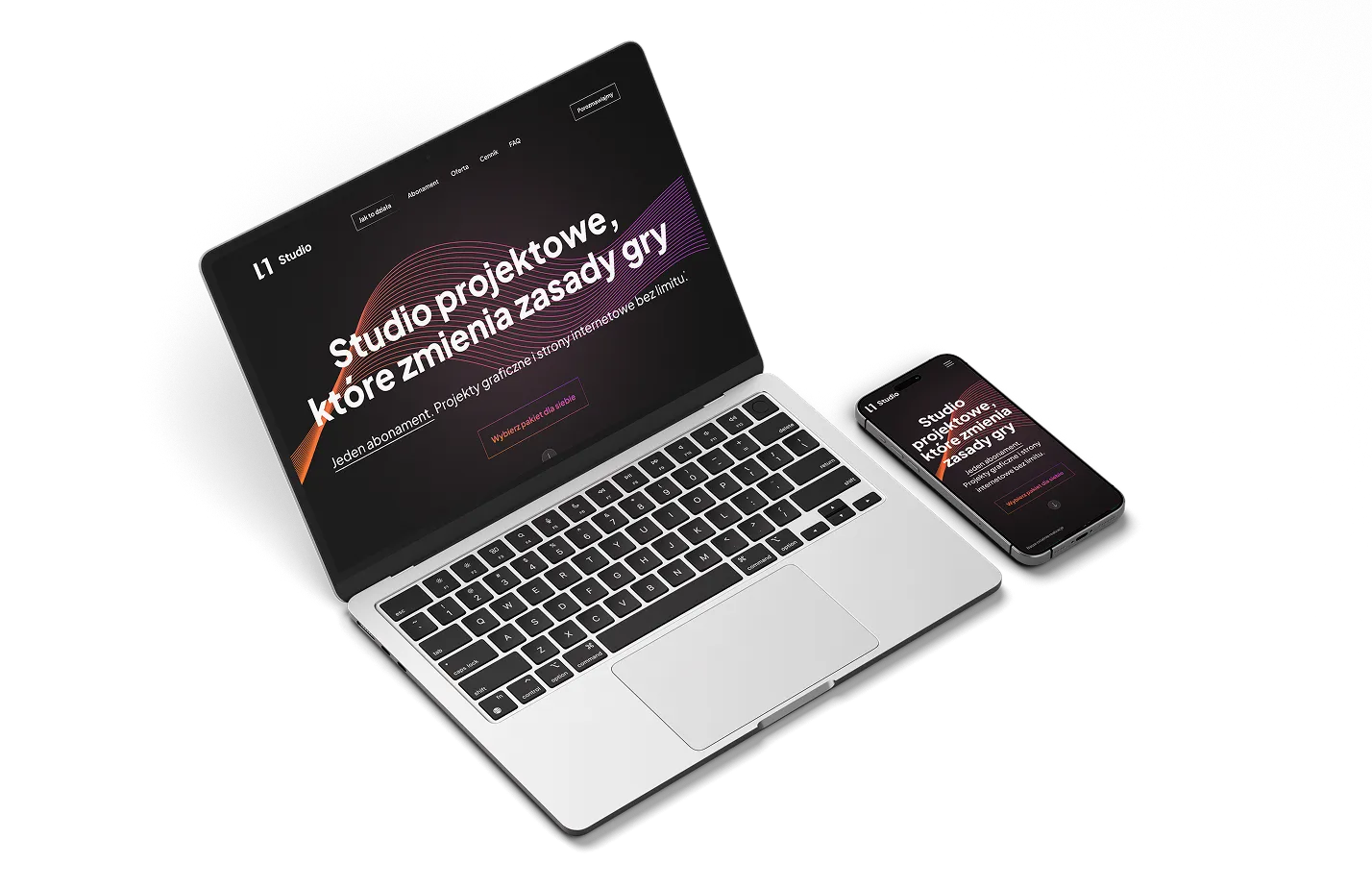
A modern landing page that explains the offer in just 3 seconds

Eleven Studio
Company name

General description

Website design and development for a newly established design studio. The studio offers a unique, subscription-based collaboration model for clients.

I was fully responsible for the entire project. This included:
- Gathering requirements
- Proposing copywriting and defining the offer’s unique selling points (USP/BVP)
- Creating wireframes
- Building mockups
- Developing the website in Webflow
Flag icon

Main Challenge

The client’s unconventional business model and high design expectations were the two main challenges in this project. Although they had a vision, it wasn’t clearly defined as a structured offer or Business Value Proposition, which made copywriting and layout development more complex.As a designer themselves, the client had very high standards for both visuals and microinteractions.There was also a technical challenge — the site needed to let users select a package, but the actual payment process had to be handled externally, outside the website.

Target icon

Defining the Client’s Key Needs

The client’s expectations and needs were gathered through a brief I provided in the form of a questionnaire. After receiving the initial answers, I followed up with more in-depth questions. These additional responses helped me better understand the client’s requirements, expectations, and the core idea behind their business model.

Main Client’s needs and expectations

A website designed primarily to attract subscribers to a monthly service

Maximum clarity of the offer

A simple process for understanding and selecting the service

Trust built through testimonials, social proof, and realistic portfolio

The site redirects users to an external platform to complete package purchases.

The site should enable the collection of potential client contact information

The site should include a portfolio gallery showcasing the studio's work

The layout should be clean and minimalist

The background color should be a shade of black

Colors and fonts must follow the brand guidelines provided by the client

The design should include microinteractions on scroll and hover

The design should convey a 3D and parallax effect while scrolling

Research

The research phase focused primarily on analyzing the websites of competing design and engineering firms. The key insights drawn from this analysis were as follows:
Questionmark icon

Most companies in this sector place little emphasis on the quality of their websites

Dashboard icon

Many of the websites are built using generic templates with minimal or no customization

Book icon

The information provided is often limited to just three elements: the company name, the industry it operates in, and contact details

Notepad icon

Content tends to be minimal and does not clearly communicate the company's service offering

Grid icon

Layouts are often outdated and frequently suffer from poor responsiveness, making them difficult to navigate on mobile and tablet devices.

Target icon

There is a noticeable lack of branding or unique visual identity, making most websites feel indistinguishable from one another

Wireframes & Copywriting

Based on the information gathered through the brief, I began by working on the copywriting. The initial proposal was sent to the client for feedback.


After finalizing the content in collaboration with the client, I prepared a wireframe, which helped me plan all the content for the website and consider the graphic elements.
Eleven Studio Wireframes

Mockups

The next step focused entirely on the graphic design itself.

For this project, I based the design on the colors and typography provided by the client in their brand identity guidelines.

Main colors

#9F25FF
#FF7a00
#F4F2F2
#121212

Font

Plus Jakarta Sans

Key UI principles

Pallete colors icon
Dark theme with dynamic visuals – a modern, standout aesthetic
Rainbow icon
High-contrast orange CTAs – for clear visibility and quick user action
Paint icon
Background animations and gradients – to give the site a tech-savvy look and feel
Mobile icon
Responsiveness – the design adapts seamlessly to all screen widths, starting from 350px.
Eleven Studio Mockup Laptop and MobileEleven Studio Mockup LaptopEleven Studio Mockup MobileEleven Studio Mockup Laptop

Webflow development

The development phase in Webflow focused on translating the mockup into a fully functional, responsive website, optimized for all screen widths—down to a minimum of 350px.

The biggest challenge during development was designing a user-friendly flow that would guide users through the subscription package purchase process. After selecting a package on the website, users were to be redirected to an external platform where they could finalize the transaction.

Following some research, I proposed a solution familiar to the local market — EasyCart.pl. It’s a service that offers full shopping cart functionality along with secure payment options. An additional advantage is that it can be fully customized to match the client’s layout, ensuring users feel like they’re continuing along the same purchase journey.
 I prepared a working demo of the checkout process for the client, who only needed to input sensitive business information, such as their company details and bank account number.

Another part of the process was implementing interactive effects — including scroll-triggered animations, hover states, and page-load transitions. I aimed to achieve a 3D-like effect and parallax motion on background elements during scrolling to enhance the immersive feel of the site.

After incorporating a few final tweaks based on the client’s feedback, the website is ready for live publication. However, the launch has been temporarily postponed due to the client’s decision to delay the official opening of their design studio.

Explore the site

Next project

Explore the full Nearby app case study
Show next project